
TheTimeo / Bridal
Cartier 1895:
held in the open
Four claws, an open basket and a band that changes the mood: a closer look at Cartier Solitaire 1895, from the profile of the setting to its presence on the hand.
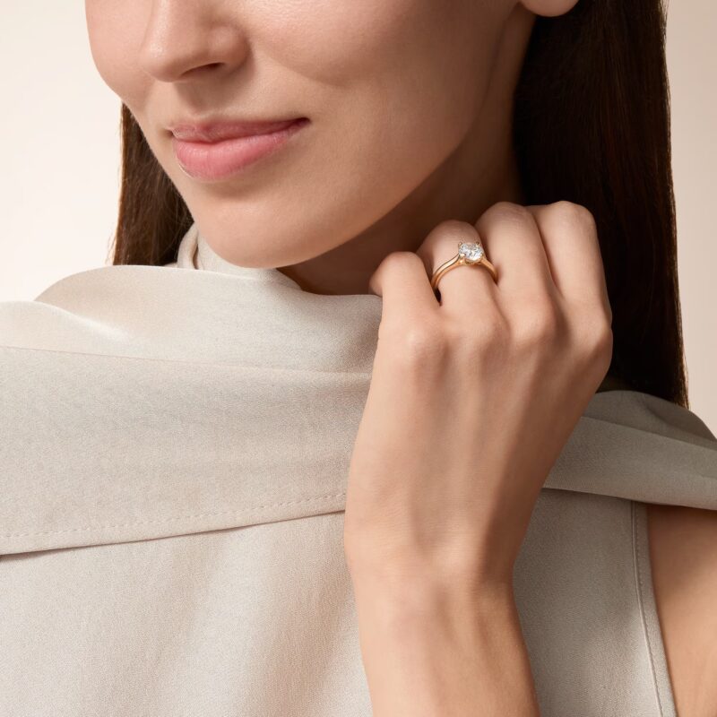
A solitaire brought back to the scale of the hand. Courtesy of Cartier.
Explore the story
The most revealing photograph of a solitaire may be the one taken from the side. In Cartier’s Solitaire 1895, a fine arc rises from the band towards the diamond, leaving an open space beneath it. That small interval gives the ring much of its character. The stone has a visible support, yet the eye can still travel around its outline.
For a bridal ring, this is a useful place to begin. Before deciding how much diamond or decorated metal you want to see, look at how the centre sits above the finger. Across the photographs here, the same idea moves between a plain band, a warmer gold tone and a line of smaller diamonds. Each makes a different part of the design speak first.
A circle, then a lift
01 / 02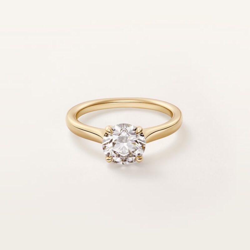
The round centre above a plain, warm-toned band. Courtesy of Cartier.
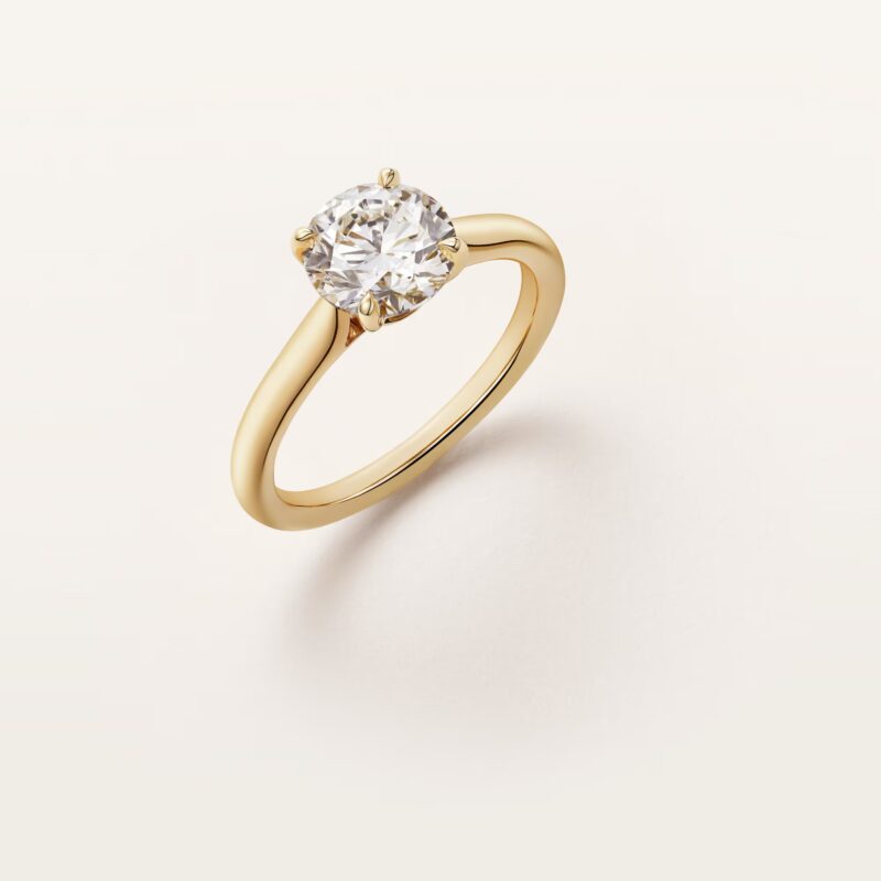
The angled view separates the setting from the curve of the band. Courtesy of Cartier.
Seen from above, the yellow-gold version draws a warm, continuous line around a round diamond. Tilt the view and the setting begins to separate from the band. The small points holding the stone become part of the silhouette; the upper half of the ring has a different rhythm from the unbroken curve below.
Cartier describes the 1895 design through four prongs and a basket. A prong, or claw, is one of the metal tips that holds the diamond; the basket is the supporting structure beneath it. In these views, that structure matters as much as the bright face of the stone. It is what turns a circle seen on a screen into a ring with height, depth and a recognisable side.
The two photographs invite a slower comparison than a sequence of different centre stones would. Follow the band into the mount. Notice where its line narrows and where the diamond begins to rise. The shape is simple enough to remember, but a small change of viewpoint gives it another expression.
The colour around the centre
The yellow tone in the first pair of photographs gives the setting a distinct edge against the diamond. In the cooler-toned profile, the eye moves more readily between the stone and its support. These are visual differences in the photographed versions, and they can help you articulate a preference before trying a ring.
Bring that comparison back to the jewellery you already wear. A favourite bracelet, a watch or a pair of earrings may tell you more about your taste than an isolated ring photograph. You might enjoy a continuous metal colour, or prefer the small interruption of a different tone. Either choice becomes more convincing when it belongs to your own wardrobe.
The diamond will also be seen against skin, sleeves and objects held in the hand. A ring chosen for a wedding becomes familiar through all of those encounters. Give the colour of its band the same attention as the first bright view of its centre.
What the side reveals
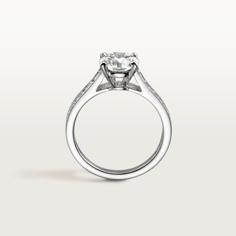
The plain profile: the shoulders rise towards an open setting. Courtesy of Cartier.
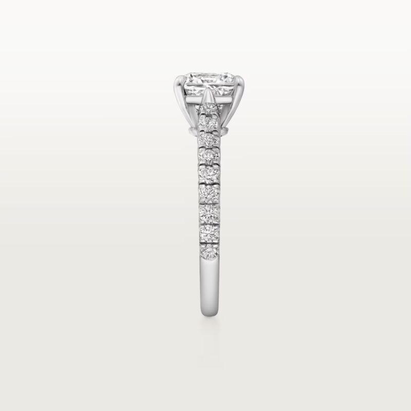
A diamond-set band carries a line of smaller stones towards the centre. Courtesy of Cartier.
The plain profile describes the ring with relatively few lines: the rounded band, the shoulders rising towards the centre and the claws above. The diamond-set version changes the surface along that route. Smaller stones continue towards the mount, creating a succession of bright points where the plain version leaves a single metal curve.
In jewellery, pavé describes closely arranged small stones that cover a surface. Here, the useful comparison is the way that surface meets the central setting. If your attention returns to the open shape beneath the diamond, a plain band may be the more compelling image. If you enjoy following light along the shoulders, the diamond-set version gives you a different detail to dwell on.
Neither photograph supplies a rule about which ring will suit a particular hand. They give you two questions to carry into a fitting: how much of the ring’s structure do you want to notice, and where do you want the decoration to begin?
Two distances from the ring
Close enough to see the setting
Turn the ring to the side and look at the meeting of claw, stone and shoulder. The upper profile will remain part of what you see whenever your hand rests on a table or holds a glass. Ask to view the ring beside the wedding band you have in mind, so you can judge the two outlines together.
Far enough to see the hand
Let your hand rest naturally, then look in a mirror. The face-on detail and the overall impression may draw you towards different versions. A ring can be beautifully resolved in a close photograph while another feels more at home with your gestures, your clothes and the jewellery you keep returning to.
The ring in a larger picture
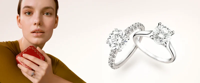
Cartier’s engagement composition brings portrait and ring views into one frame. Courtesy of Cartier.
Cartier’s wider engagement image places a portrait beside two views of a solitaire. The change of scale is instructive: a ring that fills an entire product photograph occupies a much smaller part of a person’s appearance. Its colour and outline still matter, but they now participate in a face, a pose and a way of dressing.
That is also where a bridal choice becomes personal. Try the ring with a sleeve or neckline that feels like you. Move your hand away from the display and see which detail you remember. It may be the warmth of the band, the line of the diamond-set shoulders or the open space beneath the stone.
Begin with the profile, then return to the whole hand. The version worth spending more time with is the one whose small decisions continue to interest you at both distances.
Sources & further reading
The Edit
Bridal stories
Selected stories from the same editorial universe.
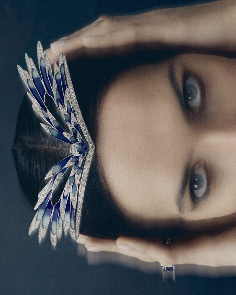
Chaumet Envol: A Tiara in Motion
Blue wings move from hair to face and cloth. Chaumet’s Envol invites a bridal
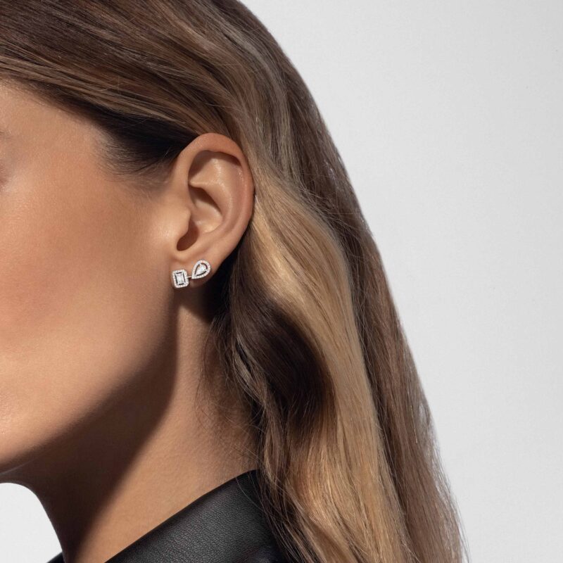
Messika My Twin: Two Cuts, One Bridal Look
An emerald cut, a pear and an unequal pair: the small asymmetry of Messika
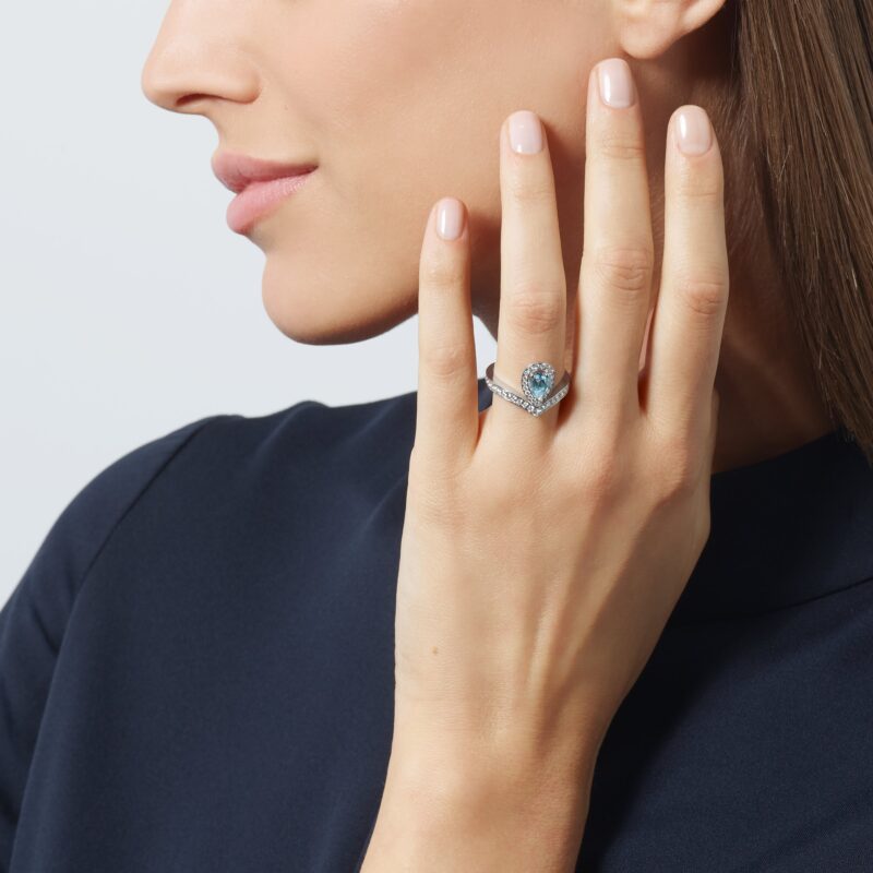
Chaumet Joséphine: Something Blue, Chosen Your Way
An aquamarine beside the face, a sapphire at the centre of a solitaire: Chaumet
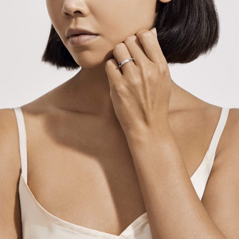
Two Rings, Two People: A De Beers Wedding-Band Edit
A rose-gold court profile, a single diamond in platinum, a fine eternity line or
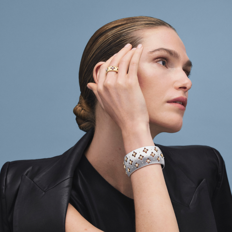
Buccellati Macri Giglio: Gold with a Grain
On the wrist, Buccellati Macri Giglio becomes a broad field of engraved gold. A

Mikimoto M: A Pearl with a Graphic Edge
White South Sea pearls, golden warmth and a sharply drawn setting: Mikimoto M offers